Wilhelmsen
From fragmented internal tooling to a task-first employee experience and corporate Media hub.
WIL app is an internal shop and service hub, a main and only distribution channel where users can order and pick up internal products, especially chemicals and occasional food orders like takeaway dinners or Christmas special.
We aimed to simplify every day tasks by creating a seamless way for employees to stay connected with company life.
Role
Product Design,
UX Research
UX Research
Platform
Mobile app
Year
2025
METRICS
We cannot fix what we can't measure so we will work with order numbers and user retention rates.
LET'S ASK PEOPLE
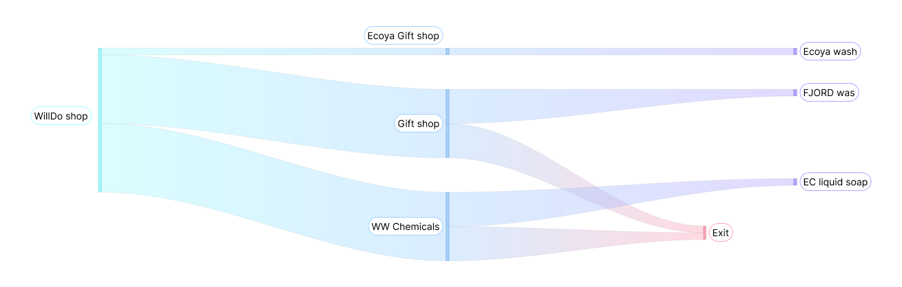
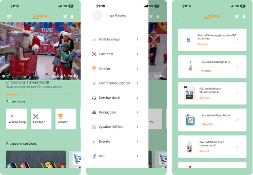
Ordering products seems to be difficult. This is the process for ordering soap. On the app products live in parallel structures, forcing users to choose between three different entry points. Not everyone knows that all three subbrands offer soap.
FINDING PRODUCTS
ISN'T EASY
Below is the process for ordering soap. On the app products live in parallel structures, forcing users to choose between three different entry points. Not everyone knows that all three subbrands offer soap.
STATUS QUO
Users have to juggle multiple external tools for in-house services in one app. This way the app instead of being a super app with one entry point to all is an app “with too much noise”.Also, employees don’t use the app for information, they use it when buying something. Many pointed out poor navigation: “If I didn’t already know where things are, it would be impossible.”
PROCESS
Problem
Many people don't know that they can check daily menu through the app. They also avoid notifications because they are hidden behind notifications and important updates are easy to miss.
Experiment
What if we replace gif banners and notifications with stories, creating an interactive media hub layer?
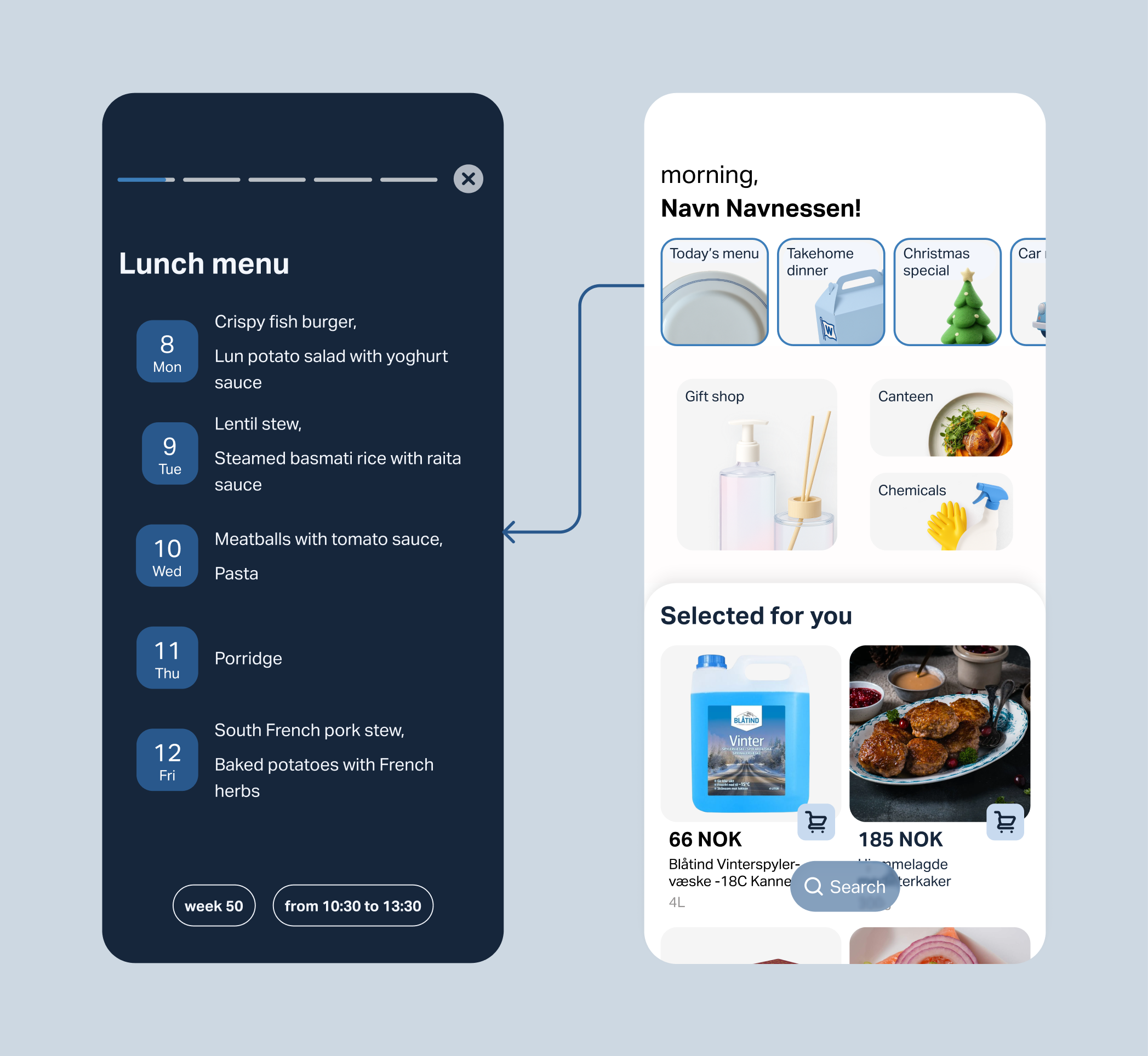
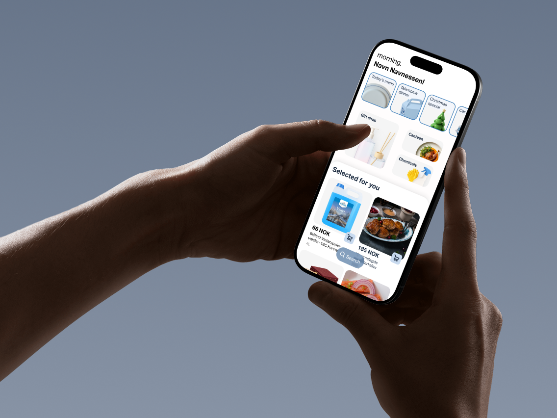
Making the home screen task-first
Products were grouped by internal shop logic, forcing people to guess where items belong and navigate parallel paths for the same need.
Solution
I restructured Chemicals, Gift shop, and Canteen around humane categories and added search, letting users find products by intent instead of brand or database structure.
.png)
Problem
Core features and external services were hidden behind a burger menu, making them hard to discover and understand.
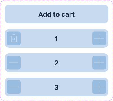
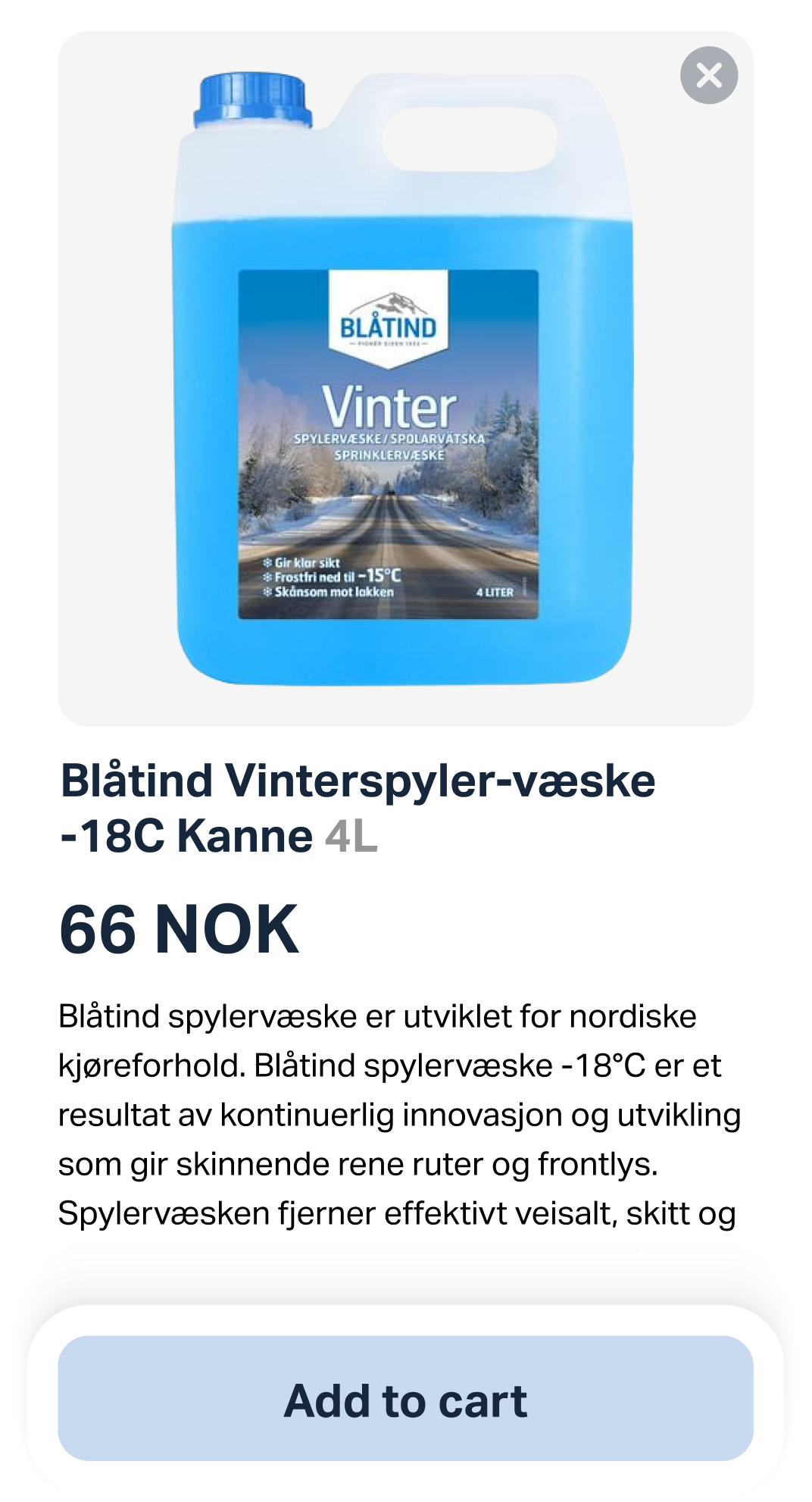
Since we're redesigning, let's enhance the product card UI along the way
I redesigned the product card with full imagery, clearer hierarchy, larger tap targets, and a microinteraction.
Solution
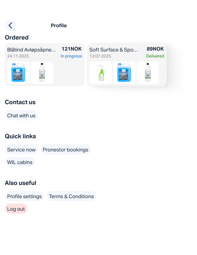
Although a burger menu can fit almost unlimited elements, it is hidden navigation and therefore harder to discover. Users are less likely to use it and it requires a lot of horizontal space.
Clicking a burger menu is an extra step, so we decided to get rid of it and move all the rethought categories to the personal profile.