
Schibsted
Reducing 10+ clicks by redesigning the interface a Media Asset Management (MAM) for VG.
VG is Norway's primary news destination. Its internal MAM system is the heart of all content: news, sports, and entertainment. I translated complex broadcasting standards processes into intuitive and clean MAM interface used by Schibsted journalists across VG, E24, Underholdning, and PodMe.
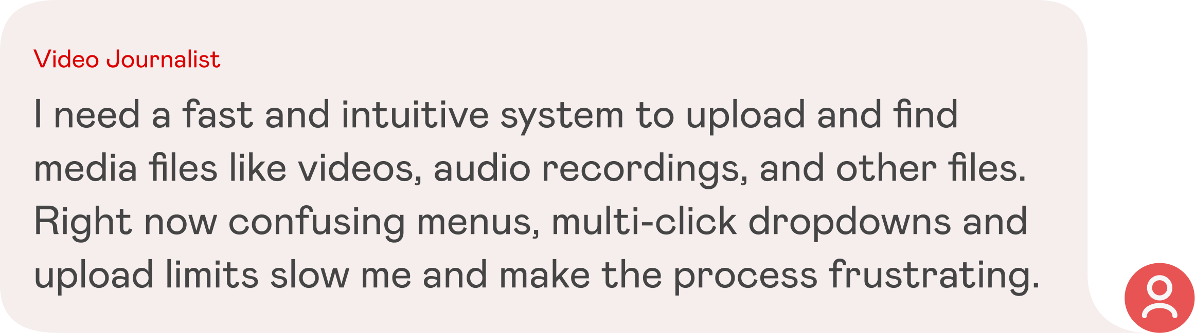
As a Video Engineer at Schibsted, I operated between Product Design and Video backend. I naturally became the first point of contact for primary users - video journalists and technical producers. Learning directly from the conditions that shaped their experience gave me unique insight into real usability issues.
Role
Product Design,
UX Research
UX Research
Platform
Desktop app
Year
2024

CHALLENGE
In a fast-paced newsroom environment, video journalists and technical producers face constant pressure to upload and publish high-quality, compliant video content.

BUSINESS GOALS
Ensure compliance with broadcast standards to avoid legal escalation, reduce errors in editorial workflows to improve accuracy and efficiency, increase publishing speed while maintaining high quality, and empower users to track progress and stay motivated.
USER GOALS
Provide an efficient navigation experience and make it easy to recover from user error. Ensure that the users can move through the MAM interface quickly and intuitively, with clear pathways to upload assets to the server.
DESIGN BRIEF
How might we help journalists to search for assets more efficiently?
How might we reduce errors in loudness compliance while keeping the workflow uninterrupted?
How might we make it easier for Technical Producers to verify and extract video assets accurately?
PROCESS
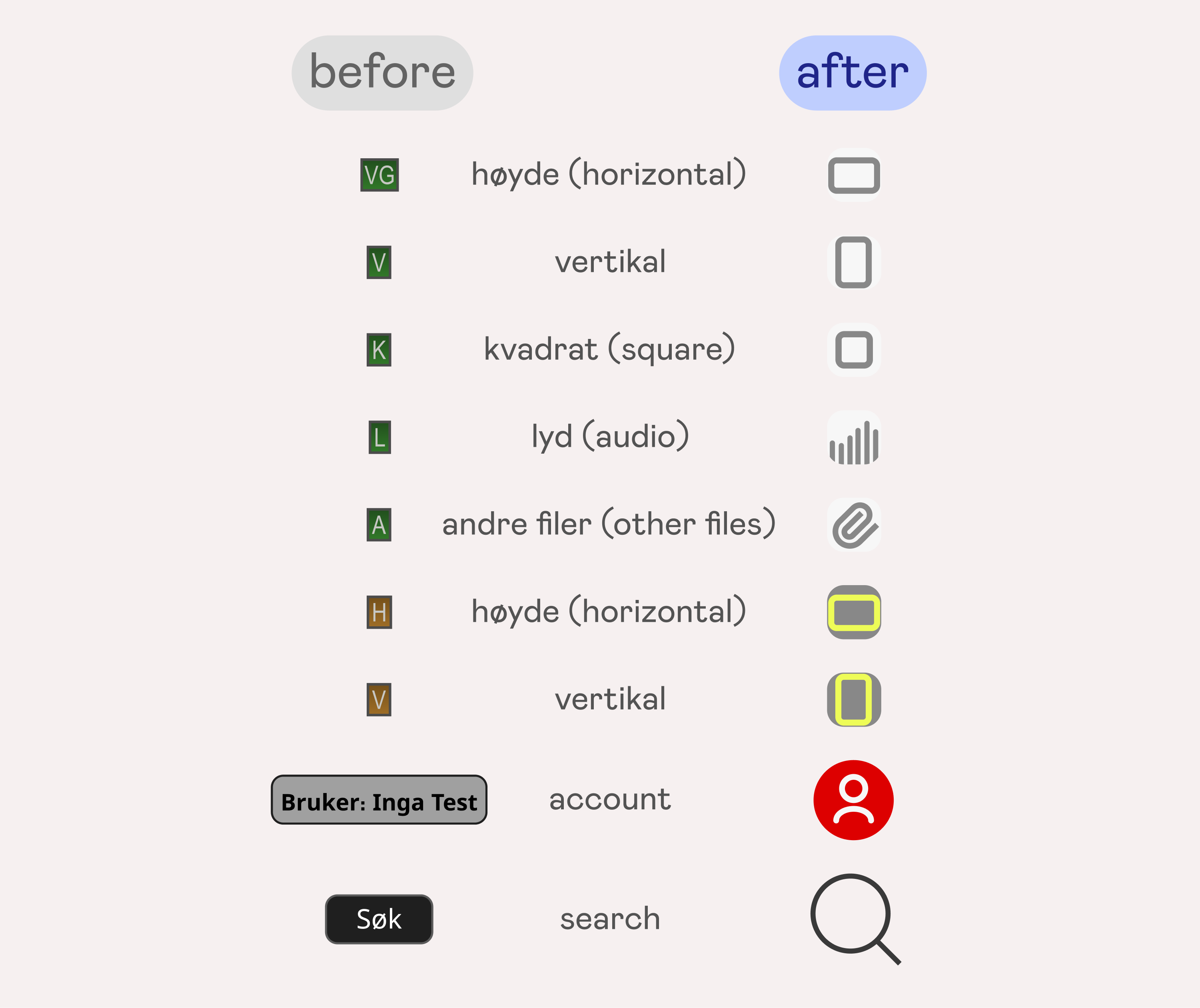
01 New icons
Introduced icons that now represent the asset’s characteristic in a shape of an icon instead of first letters of it.
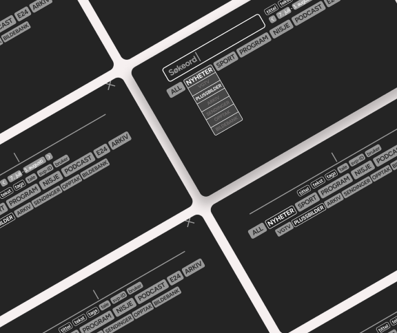
02 Simplified navigation
→ Before
We replaced the old “Next page” navigation with seamless infinite scrolling. Visitors can now keep browsing without interruptions.

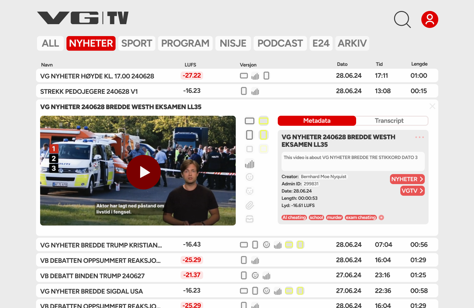
03 Building an intuitive search navigation
→ Before
We replaced the clunky, multi-click dropdown with an associative search experience that feels faster, smarter, and more natural to use. Instead of forcing users to go through multiple filters, the new system recognizes related terms and groups them into intuitive bundles.

04 Loudness control
→ Before
The standard for loudness in Europe is -23 LUFS* for TV, while for social media we aim for -16 LUFS. Previously, users had to rely on a confusing "OBS" ("attention") button that revealed no useful information until the asset was opened.
*LUFS stands for Loudness Unit Full Scale, and unlike decibels takes into account the human perception of the sound. Think TV commercials from early 2000s that suddenly cranked up the volume insanely high.

05 Personal account
→ Before
Introduced an intuitive personal account that highlights total uploads and simplifies password changes. Previously, user overviews were restricted to admins, leaving users with nothing more than a password change screen.


